IoT Bridge: interactive Map
UI and UX design
Introduction
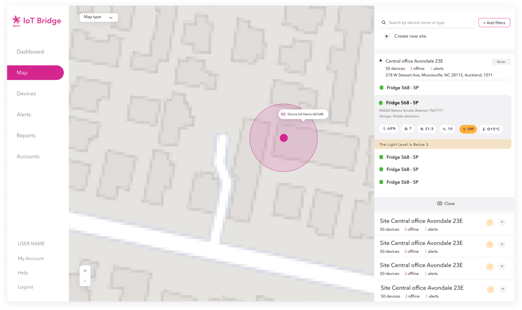
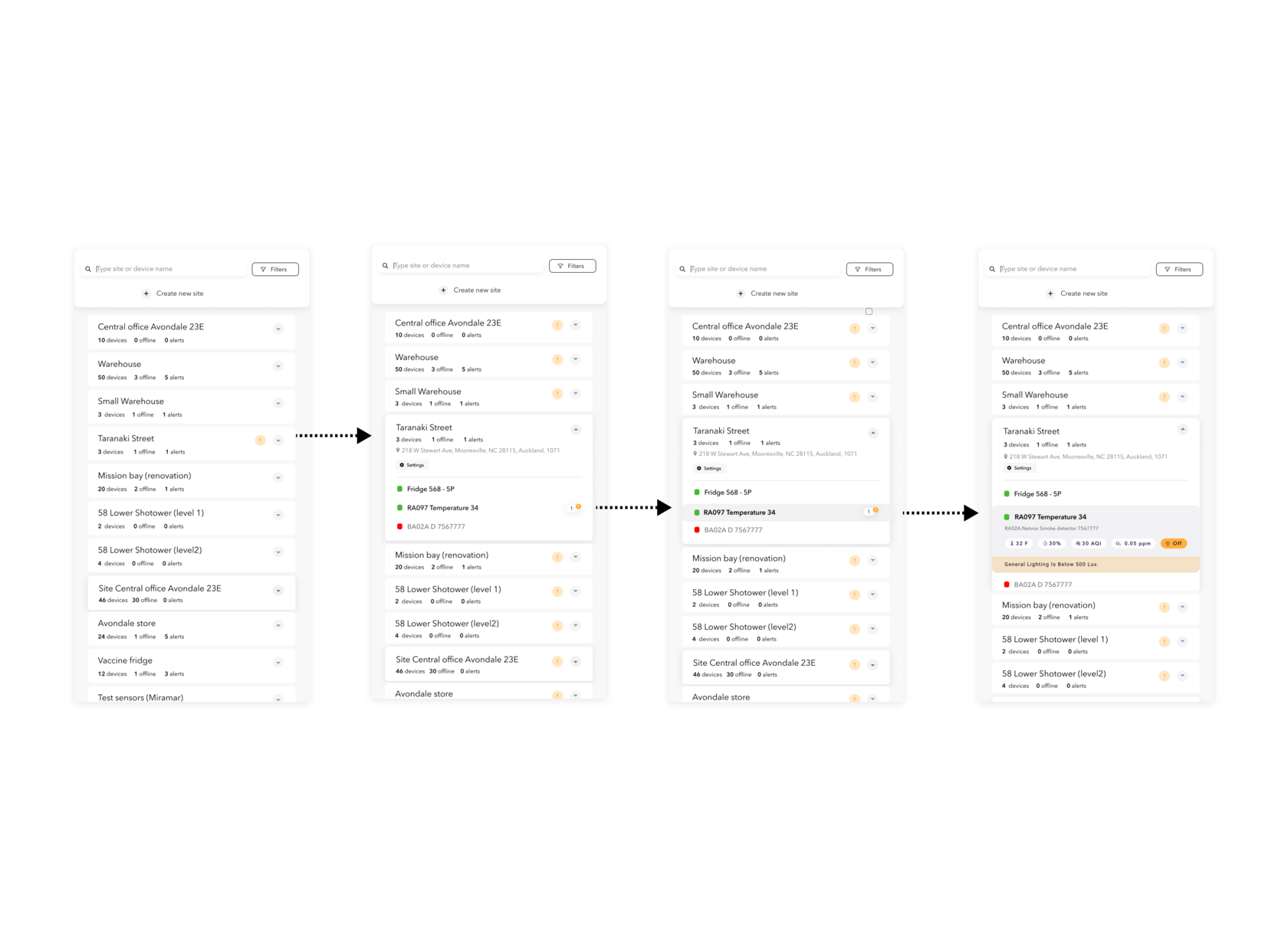
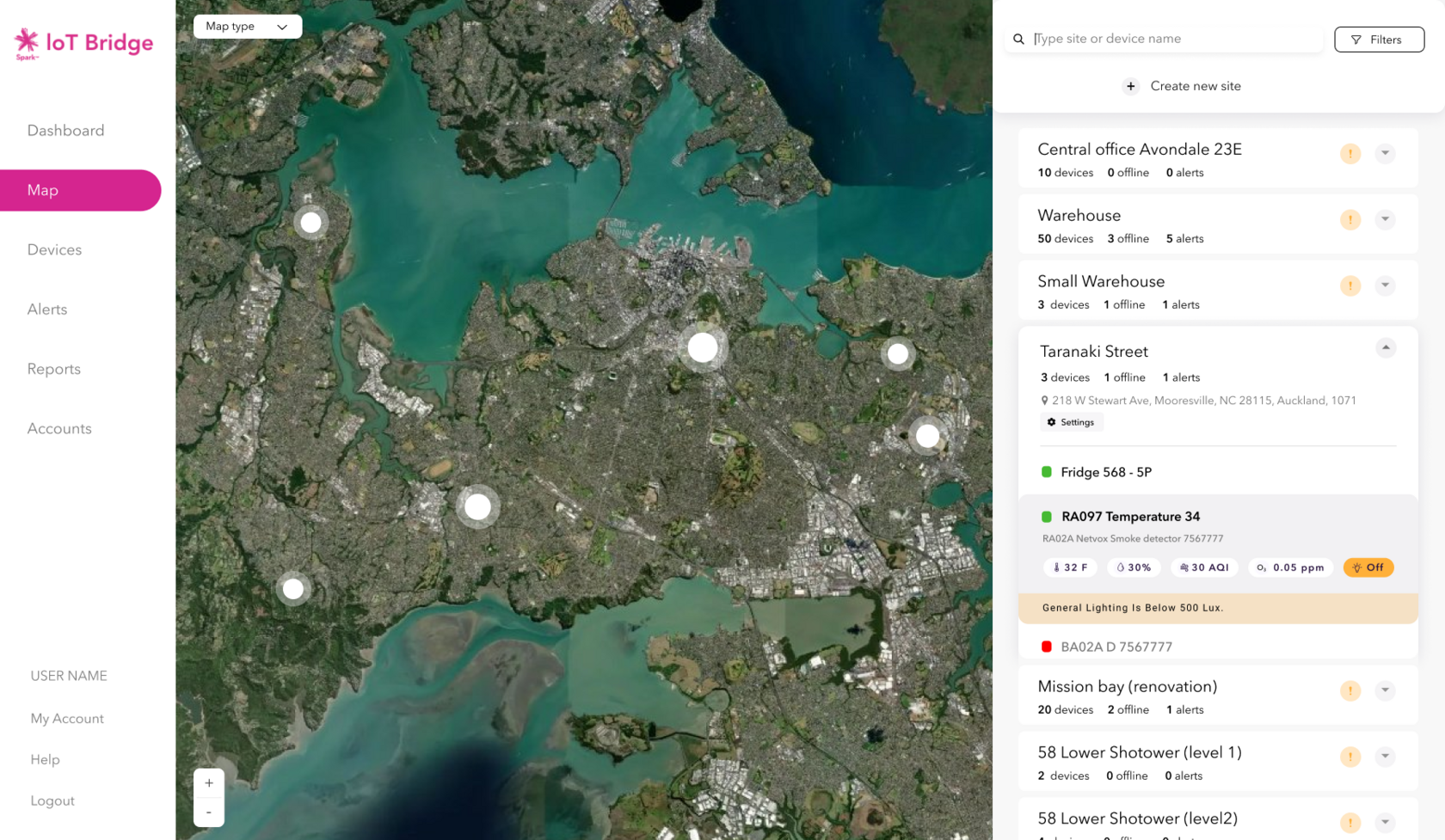
IoT Bridge is an IoT platform designed to manage devices efficiently. The project aimed to create a visual map design for device monitoring, alongside a sidebar for displaying measurements, alerts, and online/offline status. Users can also group devices into sites on the map. Additionally, a search engine with recommendations and search results was developed.
IoT Bridge is an IoT platform designed to manage devices efficiently. The project aimed to create a visual map design for device monitoring, alongside a sidebar for displaying measurements, alerts, and online/offline status. Users can also group devices into sites on the map. Additionally, a search engine with recommendations and search results was developed.
Project duration: 8 months
Team structure: 2 Product Owners, 1 Project Manager, 5 Developers, and 1 Junior Designer. We collaborated closely with the Sales, Support, and Marketing teams.
My role: user experience design, including visual map creation, sidebar interface development, and device grouping functionality. I also conducted research, competitive research, and usability testing.
Objectives
- Improve Efficiency: Reduce the time users spend locating and managing devices by providing a visual map and grouping functionality.
- Increase User Satisfaction: Elevate user satisfaction by addressing pain points identified through research and feedback.
- Provide Clear Information: Ensure that users can easily access critical information such as measurements, alerts, and online/offline status through a unified sidebar.
- Facilitate Navigation: Develop a dedicated menu for the map to streamline navigation and make it the main tool for device management.
- Support Scalability: Design the interface to accommodate future enhancements and additional features, ensuring it remains scalable and adaptable.
Problem Statement
Users of IoT Bridge struggled with the platform's textual device lists, making monitoring and managing devices cumbersome.
Competitors research
Competitive research was initially provided by the marketing team to outline project objectives and deliverables. Subsequently, I conducted further research, analyzing interaction patterns.
Competitive research was initially provided by the marketing team to outline project objectives and deliverables. Subsequently, I conducted further research, analyzing interaction patterns.
Cards sorting test
We conducted research for the information architecture to determine the optimal placement and naming of features. For example, we initially considered placing the map under "groups," but user feedback indicated a separate menu was necessary as it would be the main navigation tool.
Key findings revealed that users did not connect the terms "map" and "groups," necessitating a dedicated menu for the map to improve navigation.
Ideation
- Brainstorming
- Technical Feasibility
- Wireframes
Design
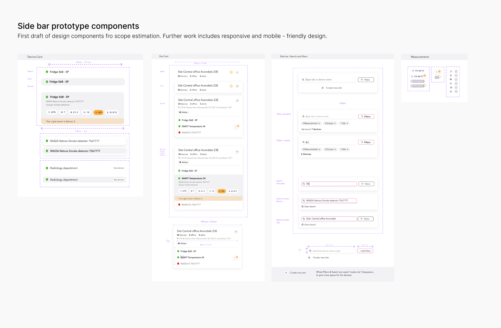
Digital Prototypes were created using Figma to simulate user interactions.
Design choices were based on research insights, such as placing critical information in an accessible sidebar and using clear icons on the map.
High-fidelity designs were developed, incorporating a consistent design system for clarity and usability. We carefully considered colour use, ensuring users understood the meaning of colours (alerts, offline, and normal states).
Usability Testing
We performed usability testing with a diverse group of users (different computer literacy and age). Testing methods included task-based assessments and feedback sessions.
User feedback highlighted areas for improvement, such as the visibility of alerts anbd devices states. Iterative design adjustments were made based on this feedback.
Project Outcomes
The IoT Bridge map redesign successfully addressed the challenges users faced with the platform's textual device lists, making device monitoring and management more intuitive and efficient.
- 1Enhanced UsabilityThe new visual map interface made device monitoring more intuitive and user-friendly, reducing user frustration and increasing ease of use.
User satisfaction increased by 35%. - 2Improved EfficiencyThe visual map and device grouping functionality significantly reduced the time users spent locating and managing devices.
Task completion time reduced by 40%. - 3Increased User SatisfactionBy addressing user pain points identified through research and feedback, the redesign elevated overall user satisfaction.
User satisfaction scores improved by 35%. - 4Clear InformationThe unified sidebar provided easy access to critical information such as measurements, alerts, and online/offline status.
Information retrieval time decreased by 30%. - 5Facilitated NavigationA dedicated menu for the map was developed, streamlining navigation and making it the main tool for device management.
Navigation efficiency improved by 50%. - 6Promoted Data Visualization and Design ThinkingTeams learned how to effectively communicate data and promoted design thinking across departments, improving overall design maturity.
Impact: Enhanced collaboration and innovation within the organization.